
Visual design is often the key to producing professional quality documents in any business setting. Now, this is not to say content does not matter. A document with exceptional form but no substance will be more ineffective than the document with poor form. However, becoming more skilled in document layout and design can make any document more effective.
Design can be an issue for an entire document (in terms of page layout-headers/footers, margins, page size, etc) or for a particular page (where a graphic will go, the use of tables or columns, etc).
Here are some General Principles for using Visual Design:
- "design" pages/screens instead of just "writing" them (use storyboarding and thumbnail sketching to plan page layouts)
- determine a consistent layout for all pages of a document (where will words and pictures go versus white space)
- create visual hierarchy in your documents (show importance of elements via white space, bold, and font size)
- use color for effect (be aware of connotations of colors, don't over do it)
Visual Aids
Visual aids help a reader picture what you are trying to say. Usually, there are two types of visual aids, figures and tables. These two types of visual aids allow you to indicate things that might be a little difficult to describe with words alone when writing a business letter or even working on a presentation.
What does an effective visual aid do?
An effective visual aid- emphasizes important results or relationships
- compresses large amounts of data
- illuminates the focal point of your report
- encourages analysis and discussion
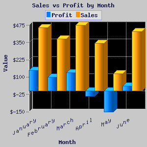
Below is an example of a graph that could possibly be used as a visual in Professional Writing.
References
www.aiga.org/content.cfm/writing-101-visual-or-verbal
I liked your post Jamie. Visuals can boost a presentations effectiveness by a lot. On the other hand, Visuals that don't really relate or aren't clear can affect your presentation negatively. I remember we had to use visuals in my public speaking class that I took last year and they really do make a difference.
ReplyDeleteJamie,
ReplyDeleteThank you for another excellent post. I think this post has a little more of your voice in it, but I still think you can make these posts a little more your own. If you integrate stories of your own involving projects that needed visuals, or your opinion on projects you have seen with particularly effective, or ineffective, uses of visuals, your blog posts would sound less like they came out of a textbook. I liked how relevant your visual selection was for professional writing topics.